Solving the parking crisis with the sharing economy

  • Branding
  • Mobile Design
  • Web Design
  • JUL 2013 - AUG 2015

The Challenge

Parkhound is an online car parking Marketplace based in Australia where Sellers make extra cash by listing their spare parking spaces and Buyers find cheap parking options in and around cities and suburbs.

The service launched at the end of 2013 and has gained steady traction since, providing a valuable solution to the parking crisis in the country.

MVP

Parking marketplaces were not a new idea, there were already implementations both in Australia and internationally. It was a good sign as competition helps validate that there is a market that can sustain a business.

We created a MVP using a simple Shopify template which allowed us to upload listings. Meanwhile I designed a landing page for Parkhound to explain the proposition and direct users to the Shopify site.

One feature we explored was a place where users could tell their parking horror stories, providing them a way to vent frustration while resonating with the problem we were solving.

Brand

The goal was to really stand out from the competition, to create something that was personable and we could use to tell a story.

After iterating through a number of parking related symbols, I felt that they were too generic and conceived the idea of using man’s best friend. This symbol helped us create some branded terminology for our users, who we always welcome to the ‘pack’.

Some of the elements from the Parkhound Brand Guidelines.

Responsive Design

We knew the web app needed to be designed responsively so that it worked seamlessly across all devices. Booking parking spaces for long periods ahead of time translated well to desktop, however we wanted to encourage the behaviour of finding parking spaces in real time when on the move. This required a solution that worked equally well on mobile.

Style Guide

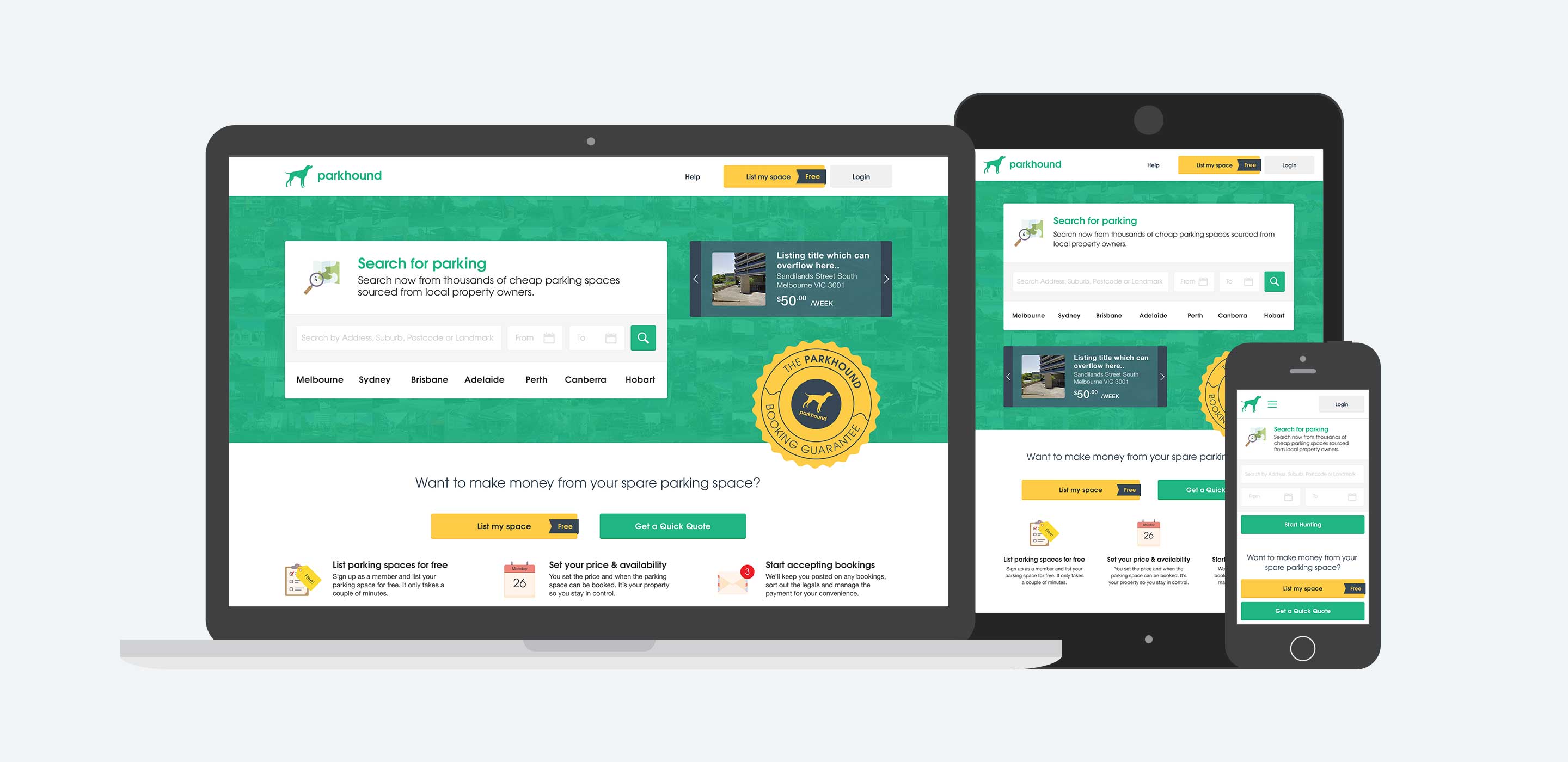
Initially I designed all screens at Desktop, Tablet and Mobile screen sizes, making sure that content was shifted and prioritised to meet the needs of the user on that device. However, I recognised that this wasn't a very efficient way of communicating designs to our developers. We needed to create components which could be designed once and re-used throughout the site, we needed to create a Style Guide.

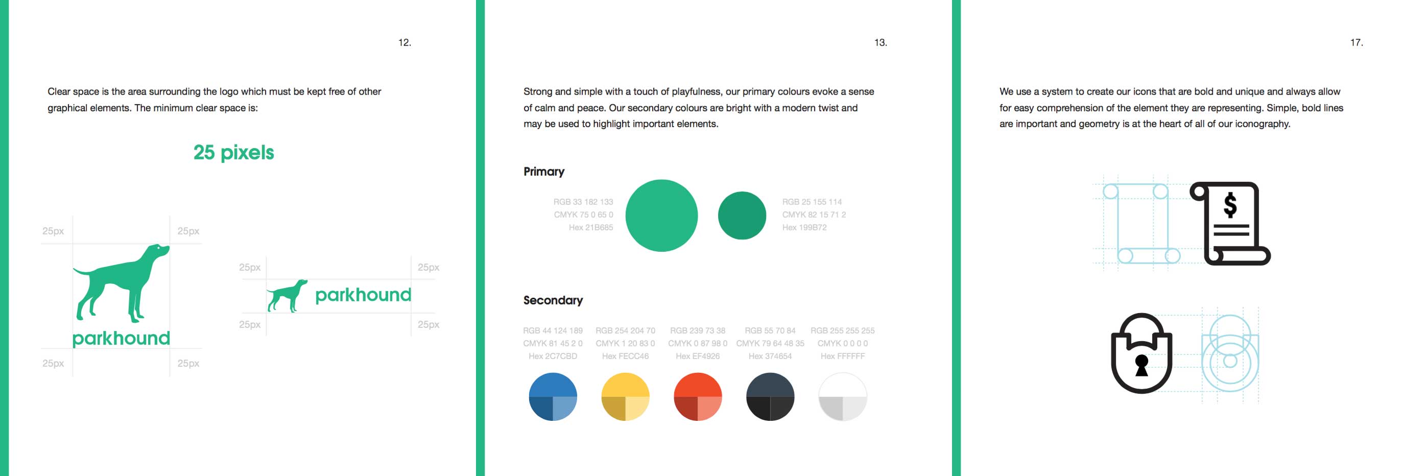
The Style Guide would be a living document, whose HTML structure, class naming conventions and css(scss) styles would be used to define the front-end of the app. It would be a single source of truth where developers could come to pick and choose components to make up the app flows. This way they could spend less time on the design and more on the functionality.

Going Native

It became important early on that we had a presence in the app store. Because the website had been designed to be responsive, we were able to take a hybrid approach and provide some native functionality while we developed a more robust set of API’s on the back-end. This way, any features that we hadn’t yet developed for iOS would call a web view in the app without degrading the user experience.

Users search for a park in their area, view the details and book.

The app is constantly receiving updates and becoming closer to feature parity with the website. The app was featured in the Australian App Store and has received more than 7,000 downloads.

Best New App

Use video to sell your property

3 min read