Connecting physicians and patients for better health

  • Product Strategy
  • Mobile Design
  • Web Design
  • Web Development
  • APR 2013 - Ongoing

The Challenge

Healthcare is most certainly broken. In this technological age, patient records are still mostly paper based and difficult to share and patient data still widely belongs in the hands of large medical institutions rather than the patients themselves.

In many countries (particularly in the US) healthcare is becoming more and more inaccessible to those outside of corporate sponsored health plans and private insurance policies.

One company which looks to address these challenges is Jio Health. Their founder & CEO approached me early 2013 with a vision that immediately piqued my interest.

“I'm grateful for Hamish's contributions to our team, most noteworthy of which is the establishment of design as a core part of our organization's geneaology.”

Raghu Rai - CEO & Founder

The Beginning

Jio was initially a consumer facing proposition, we allowed consumers to track vital metrics & nutrition, manage medication and share their progress with close family and friends.

Early wireframes of the Consumer App.

End to End

Jio's capacity to empower an individual to take back control of their health however, really lay in the ability to connect a consumer directly with a physician.

To facilitate this connection and to ensure that the experience was as seamless as our standards required, we started work on the Jio Physician app.

For Consumers

Consumers are able to search a directory of physicians based on preferences like location or specialty and filter by price or rating. They can then book an appointment with a physician either in person or via telemedicine (video call). By sharing their health profile after an appointment has been made, physicians are better informed about the consumers needs.

Consumers are able to search for physicians, view their profile and book a telemedicine consultation.

For Physicians

Jio enables physicians to create direct consumer relationships with a larger patient population. They can access a patients health profile, clinical notes and history in order to deliver better care. Physicians can earn more income by providing remote services such as telemedicine.

Physicians can connect with patients, access their health profile and consult with them via telemedicine.

Web Presence

To coincide with the launch of the Jio Physician service, jiohealth.com needed to be redesigned to better communicate the benefits of the platform. The site was to be available in both English and Vietnamese, so I decided it was time to integrate a Content Management System.

I chose to use a great little CMS called Perch because it met all our current requirements while also being flexible enough to expand with us in the future. Most importantly it has a really simple admin interface which makes it easy for admin users to add content.

Growing Pains

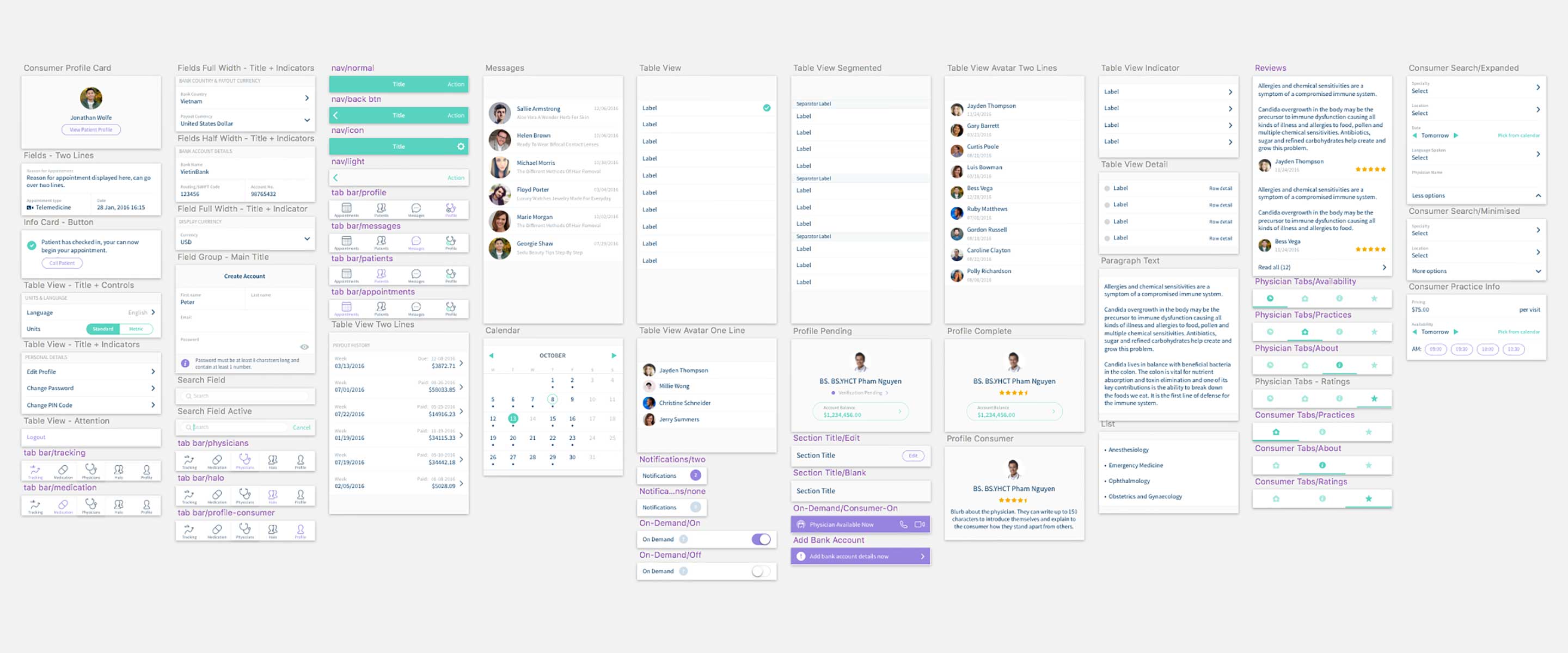
With four apps out in the wild - Consumer & Physician apps on both iOS and Android - and a growing feature set on each, maintaining design consistency between them was becoming difficult. Jio had progressed to this point over many months and some of the older features were starting to show their age.

It was time to take stock of the current situation and begin efforts to consolidate the design across the service, it was time to create a Style Guide.

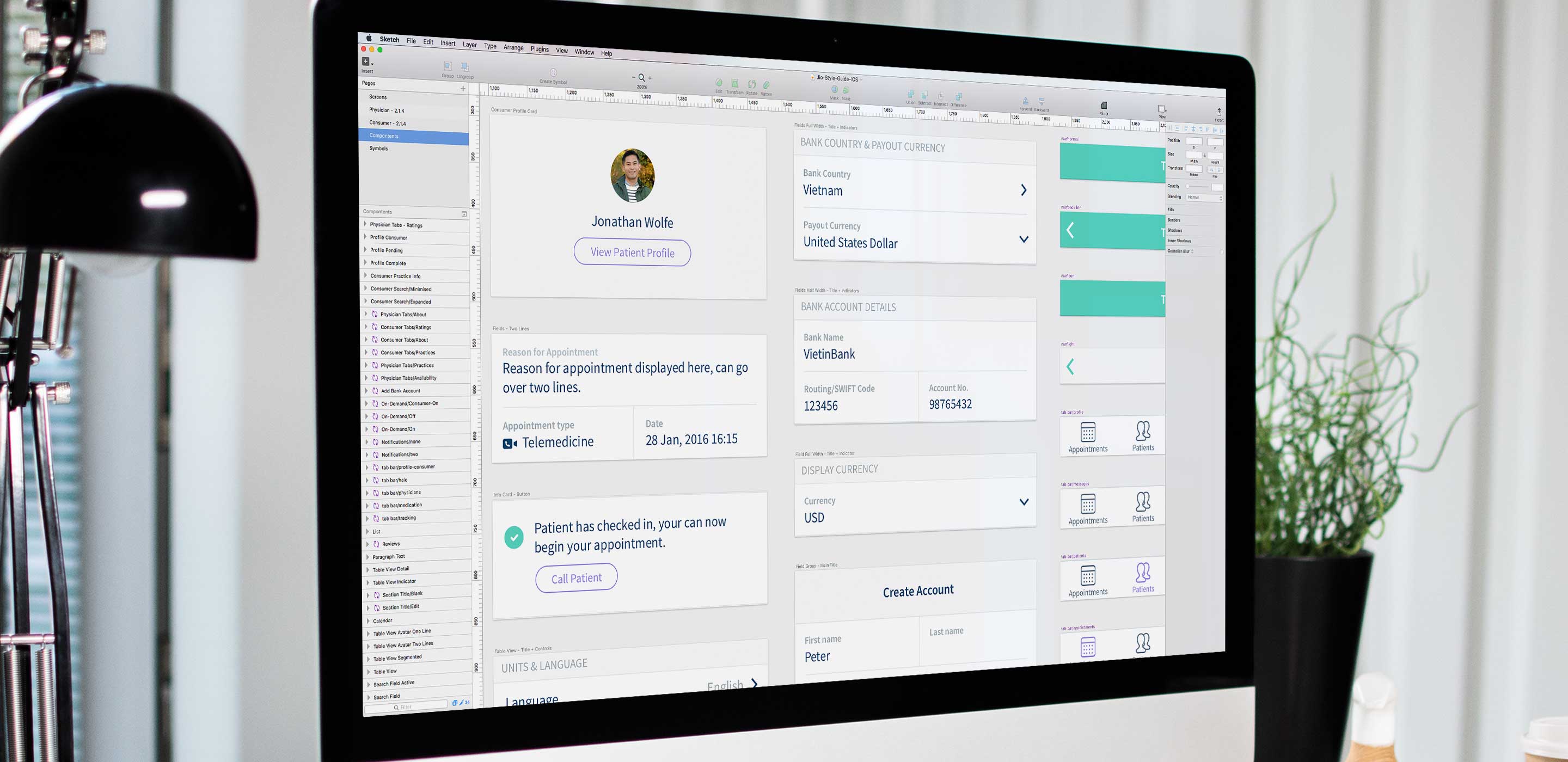
The current state of the iOS App Style Guide.

There are many benefits to creating a Style Guide and I would encourage any product owner to think about this early in their evolution as it only becomes more difficult to build as time goes on.

The benefits include:

  • Visual consistency helps make an interface less confusing to users. There is often a lot of inconsistency across apps due to the time spans in which they were developed.
  • It speeds up the definition of new features. By having a library of pre-designed components, you can pick and choose which existing elements can be used to make up new screens.
  • It speeds up development. The pre-designed components can be used by developers to prototype new features quickly without relying on completed designs to start development.
  • When these elements are coded in a modular way, developers can easily choose from pre-developed components to build new features.
  • Eventually you will reach a point where very little new elements need to be designed. For any new app features, the default should be to select components from the Style Guide. If there is no element fit for purpose then it becomes a candidate for addition.

Roadmap

Watching the industry evolve over an extended period of time gave me some great insight into how users see technology playing a role in their health. These insights would lead to ideas and these ideas to potential features we could add to Jio.

I would have regular discussions with Raghu the CEO & founder about the direction of the product. These coversations would result in a list of prioritised features which would become candidates for further refinement.

“Our discussions go beyond UI/UX and examine how the fundamentals of our business work.”

Raghu Rai - CEO & Founder

Designing Design

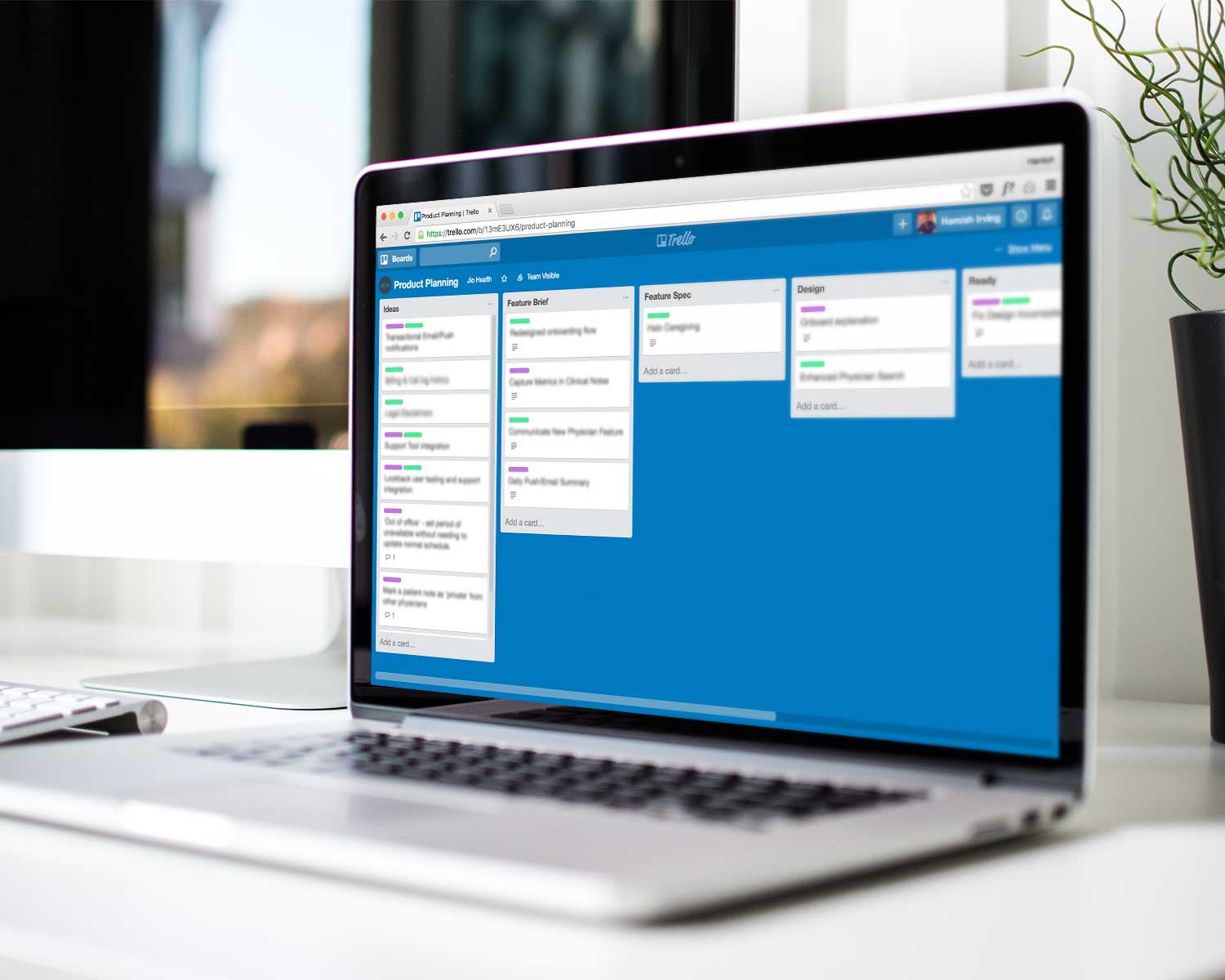
With a growing userbase, feedback and new feature requests started to roll in from our users. As a product team we had our own ideas about what items should be on the roadmap and our sales & marketing team were generating some great insights out in the field.

Filtering through all the requests was becoming difficult and I recognised we needed a more structured way to prioritise features for development. After researching companies such as Intercom and UserVoice I was able to distill down Jio's own product development guidelines.

Before any feature could be considered for inclusion, a one-page brief had to be completed. It helped to:

  • Identify if the feature was a smaller incremental change or a big game-changer which aligned with the product vision. This helped with prioritisation later.
  • Ensure that the team was clear why the feature was being considered. The why needed to be anchored to a user benefit and not just because an investor asked for it.. well sometimes it was because an investor asked for it.. 🙄
  • Identify what was in scope and sometimes more importantly what was out of scope.
  • Define some success metrics so that the feature could be evaluated after implementation.

Looking Forward

The process helped us become a lot more intentional about which features we were building. It allowed us to be proactive and make sure we were making progress towards our vision, and not just reactive to the wave of requests coming in from various sources.

I remain in regular contact with Jio and continue to consult for them on a part-time basis providing high level strategic advice and design mentorship to their in-house designer.